This post was imported from my old Drupal blog. To see the full thing, including comments, it's best to visit the Internet Archive.
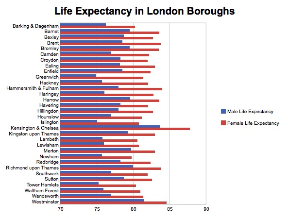
Update: For the people who couldn’t read the post because the graph didn’t have 0 as its x-axis minimum, here is the version of the graph that does. I haven’t removed the other version, since doing so would make the comments confusing and I think it’s interesting to compare the two.
There are idealists who immediately see the publication of Open Data as a Good Thing, and leap up and down (metaphorically or physically) shouting “Raw Data Now”. There are also a whole bunch of people who need to “see the shiny”. They need to understand why publishing Open Data is a Good Thing, and most particularly what the benefit is going to be to them.
This is understandable. Publishers bear the cost of the development of URI schemes, XML formats, RDF ontologies, and other infrastructure for serving data, and the ongoing maintenance cost of domain resolution, bandwidth usage and user support. Even publishers with a public-service remit (who may not need to see monetary payback) need to be convinced that there will be some kind of return on the investment.
One result of making data available is that it enables you and others to easily construct nice visualisations over the data, and maybe spot useful patterns within it. This is particularly useful for public sector information because it can provide feedback on how effective a particular policy has been or where more resources need to be spent.
So I thought it would be worthwhile trying to explore how to create visualisations of some data, starting with the London Borough data that I’ve published using Talis.
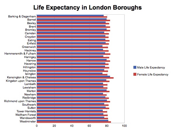
Nowadays, there are a bunch of visualisation libraries around. My first experiment is going to be using the Google Visualisation API, which offers a range of different, reasonably pretty, visualisations that work cross-browser using either SVG or VML. In this post, I’m going to use the barchart visualisation, to create a chart of male and female life expectancy in the London Boroughs. It looks like this:
One of the interesting things about the Google Visualisation API is that you can provide the data for every visualisation using a Data Source. A Data Source is any web page that, in the face of particular requests, returns JSON in a particular format. The format basically encodes a table with named (and typed) columns and a number of rows containing cells which have values for each of those columns.
For the London Borough data, the JSON needs to look something like:
google.visualization.Query.setResponse({
  version:0.6,
  status:'ok',
  reqId:0,
  table:{
    cols:[
      {id:'label', type:'string'},
      {id:'maleLE', type:'number'},
      {id:'femaleLE', type:'number'}
    ],
    rows:[
      {c:[
        {v:'Barking & Dagenham'},
        {v:76.3},
        {v:80.3}]},
      {c:[
        {v:'Barnet'},
        {v:79.5},
        {v:83.6}]},
      {c:[
        {v:'Bexley'},
        {v:78.7},
        {v:82.7}]},
      ...
    ]}
})
Now we already know, from my last couple of blog posts, how to query the Talis platform through its SPARQL endpoint, and how to use Talis’ transformation service to invoke an XSLT transformation over the XML that we get back from that. The same principle applies:
- create a SPARQL query that will return the information we want
- create an XSLT transformation that will tidy the result into the format we want it
- set up a PHP page to access the relevant URI and pass through the results
- create an .htaccess file so that invoking the PHP can be done without revealing it’s PHP
First, the SPARQL query. As I said, a Data Source is essentially a table of named columns. While we could do a DESCRIBE or CREATE query, a SELECT query is a lot closer match to the tabular layout that the Data Source needs because it’s also essentially a table of named columns (the variables you select). For the data that we want in the table, an appropriate SPARQL query would be:
SELECT ?label ?maleLE ?femaleLE
WHERE {
  ?borough a <http://www.jenitennison.com/ontology/data#LondonBorough> .
  ?borough <http://www.w3.org/2000/01/rdf-schema#label> ?label .
  ?borough <http://www.jenitennison.com/ontology/data#maleLifeExpectancy> ?maleLE .
  ?borough <http://www.jenitennison.com/ontology/data#femaleLifeExpectancy> ?femaleLE .
}
ORDER BY ?label
Plugging this query into the Talis SPARQL endpoint (have a go at http://api.talis.com/stores/rdfquery-dev1/services/sparql if you like) gives a response in the SPARQL Query Results Format which looks like:
<sparql xmlns="http://www.w3.org/2005/sparql-results#">
<head>
<variable name="label"/>
<variable name="maleLE"/>
<variable name="femaleLE"/>
</head>
<results>
<result>
<binding name="label">
<literal>Barking & Dagenham</literal>
</binding>
<binding name="maleLE">
<literal datatype="http://www.w3.org/2001/XMLSchema#decimal">76.3</literal>
</binding>
<binding name="femaleLE">
<literal datatype="http://www.w3.org/2001/XMLSchema#decimal">80.3</literal>
</binding>
</result>
<result>
<binding name="label">
<literal>Barnet</literal>
</binding>
<binding name="maleLE">
<literal datatype="http://www.w3.org/2001/XMLSchema#decimal">79.5</literal>
</binding>
<binding name="femaleLE">
<literal datatype="http://www.w3.org/2001/XMLSchema#decimal">83.6</literal>
</binding>
</result>
<result>
<binding name="label">
<literal>Bexley</literal>
</binding>
<binding name="maleLE">
<literal datatype="http://www.w3.org/2001/XMLSchema#decimal">78.7</literal>
</binding>
<binding name="femaleLE">
<literal datatype="http://www.w3.org/2001/XMLSchema#decimal">82.7</literal>
</binding>
</result>
...
</results>
</sparql>
The second step – transforming this SPARQL result into JSON – just take a little bit of XSLT (1.0, remember, because that’s all the Talis’ Transformation Service can manage). My aim in this post is to show that anyone, even if they don’t have write access to a Talis data store, can create these visualisations, so I’ve just put the XSLT on my site at http://www.jenitennison.com/visualisation/data/SRXtoGoogleVisData.xsl. I’m not going to duplicate it here; it’s generic enough for reuse should you want to.
The third step is to create some PHP that handles a query from the Google Visualisation. The requests will include two parameters:
tqxdefines details about how the data should be returned, such as its formattqdefines a query in the Google Visualisation API query language that identifies precisely the data that should be returned
I want this PHP to be reusable, so I’ve created a utils.php that looks like this:
<?php
  $store = 'rdfquery-dev1';

  function proxy($filter, $order) {
    global $store;
    $tqx = $_GET['tqx'];
    $tq = $_GET['tq'];

    // Parse tq parameter
    if ($tq) {
      $select = stristr($tq, 'select ');
      $select = substr($select, 7);
      $select = explode(',', $select);
      foreach ($select as $var) {
        $var = trim($var);
        $vars[] = "?$var";
      }
      $vars = implode(' ', $vars);
    } else {
      $vars = '*';
    }
    $sparql = "SELECT $vars WHERE { $filter } ORDER BY $order";

    $params = array('query' => $sparql, 'output' => 'xml');
    $query = http_build_query($params);
    $rdfURL = "http://api.talis.com/stores/$store/services/sparql?$query";

    // URL for the transformation
    $params = array('xml-uri' => $rdfURL,
      'xsl-uri' => "http://www.jenitennison.com/visualisation/data/SRXtoGoogleVisData.xsl",
      'tqx' => $tqx);
    $query = http_build_query($params);
    $txURL = "http://api.talis.com/tx?$query";

    $resource = fopen($txURL, 'rb');
    header('Content-Type: application/json', true);
    fpassthru($resource);
    return;
  }
?>
Things to note here are about the processing of the tq and tqx parameters that are sent by the Google Visualisation to control what and how the data appears. The tqx parameter gets passed through into the stylesheet as a parameter, and parsed there. The tq parameter is used to construct the SPARQL query itself, specifically which variables will get included within the result. The rest of the SPARQL query – the filter and the ordering – are set in the code which calls the proxy() function, which is in london-borough.php within the same directory, and looks like:
<?php
  include "utils.php";
  proxy('?borough a <http://www.jenitennison.com/ontology/data#LondonBorough> .
         ?borough <http://www.w3.org/2000/01/rdf-schema#label> ?label .
         ?borough <http://www.jenitennison.com/ontology/data#maleLifeExpectancy> ?maleLE .
         ?borough <http://www.jenitennison.com/ontology/data#femaleLifeExpectancy> ?femaleLE .',
        '?label');
?>
This code defines the names of the variables that can be used within the tq parameter, and therefore selected and displayed within the graph. So for example, if I request:
http://www.jenitennison.com/visualisation/data/london-borough?tq=select+label,+maleLE
this translates into the SPARQL query:
SELECT ?label ?maleLE
WHERE {
  ?borough a <http://www.jenitennison.com/ontology/data#LondonBorough> .
  ?borough <http://www.w3.org/2000/01/rdf-schema#label> ?label .
  ?borough <http://www.jenitennison.com/ontology/data#maleLifeExpectancy> ?maleLE .
  ?borough <http://www.jenitennison.com/ontology/data#femaleLifeExpectancy> ?femaleLE .
}
ORDER BY ?label
At the moment, the PHP just uses the select portion of the tq parameter to determine which data to display. It would be possible to map other aspects of the Google Visualisation query language onto SPARQL, but this will do for now.
The final step is to amend the .htaccess to do a basic rewrite to prevent people from having to put .php at the end of the URI because I don’t like URIs that indicate the technology they’re using. In this case it looks like:
<IfModule mod_rewrite.c>
  RewriteEngine on
  RewriteCond %{REQUEST_FILENAME} !-f
  RewriteCond %{REQUEST_FILENAME} !-d

  RewriteRule ^(.+) $1.php [L,QSA]
</IfModule>
as this gives me flexibility later on to add more PHP files that can do similar things.
So now we have a Data Source that can provide the label, male life expectancy and female life expectancy for the London Boroughs. Using it requires a copy and tweak of an example from Google:
<html>
  <head>
    <script type="text/javascript" src="http://www.google.com/jsapi"></script>
    <script type="text/javascript">
      google.load("visualization", "1", {packages:["barchart"]});
      google.setOnLoadCallback(drawChart);
      function drawChart() {
        // Replace the data source URL on next line with your data source URL.
        var query = new google.visualization.Query('http://www.jenitennison.com/visualisation/data/london-borough');
        query.setQuery('select label, maleLE, femaleLE');
        // Send the query with a callback function.
        query.send(handleQueryResponse);
      };
      function handleQueryResponse(response) {
        if (response.isError()) {
          alert('Error in query: ' + response.getMessage() + ' ' + response.getDetailedMessage());
          return;
        }

        var data = response.getDataTable();
        data.setColumnLabel(1, 'Male Life Expectancy');
        data.setColumnLabel(2, 'Female Life Expectancy');
        var chart = new google.visualization.BarChart(document.getElementById('chart_div'));
        chart.draw(data, {
          width: 600,
          height: 450,
          is3D: false,
          title: 'Life Expectancy in London Boroughs',
          axisFontSize: 10,
          colors: ['#4162B5', '#CF413A']});
      };
    </script>
  </head>

  <body>
    <div id="chart_div"></div>
  </body>
</html>
The drawChart() function is where the URL to the Data Source gets set. It’s actually done in two parts:
var query = new google.visualization.Query('http://www.jenitennison.com/visualisation/data/london-borough');
sets the base URI to be used, and:
query.setQuery('select label, maleLE, femaleLE');
sets the value of the tq parameter without you having to worry about escaping the special characters it may contain.
After getting the data, I set the column labels in the code itself: they aren’t provided in the Data Source because it’s easier and more generic this way. Plus I set a bunch of other display options within the HTML page, so it seems like the right place for it.
The result of all this is a graph that you can see at http://www.jenitennison.com/visualisation/london-borough-life-expectancy.html.
If you want to do something similar, feel free to grab hold of utils.php. You can either reuse my hosted copy of SRXtoGoogleVisData.xsl or move it onto your own site. Then all you have to do is:
- adjust the graph variable in
utils.php, and the location ofSRXtoGoogleVisData.xslif you need to - create another PHP file similar to
london-borough.phpthat defines a filter and an ordering over a set of data - tweak your .htaccess if you want to
- create an HTML page that references your Data Source to create a Google Visualisation
My current plan is to continue to refine utils.php and SRXtoGoogleVisData.xsl to make it easy to create SPARQL-backed visualisations. More soon.