This post was imported from my old Drupal blog. To see the full thing, including comments, it's best to visit the Internet Archive.
I wrote previously about a visualisation using Home Office data to navigate around categories of offences. The second interesting set of data from the Home Office that I found, tucked away in a small link on a page about Crime Reduction Toolkits was a spreadsheet of recorded crime statistics between 1898 and the present day. Each column is a different category of offence (I won’t say class because they don’t map onto the Classes from the spreadsheet of notifiable offences).
This time I wanted to try out the jQuery sparklines plug-in to illustrate how crime notifications have changed over time. The resulting page is available at http://www.jenitennison.com/visualisation/crime.html; here’s a screenshot for Bigamy:
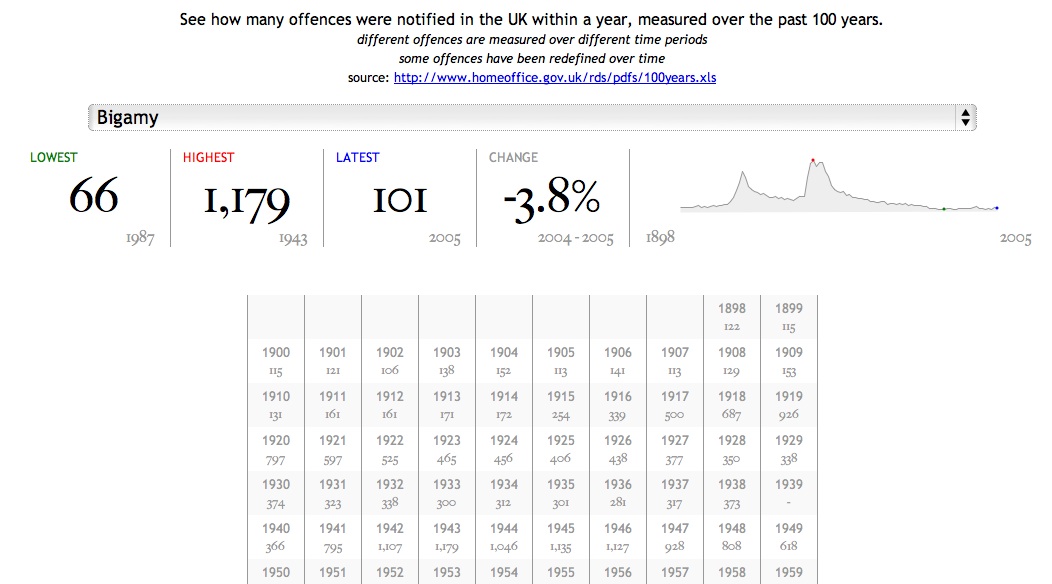
(I chose Bigamy because there are some interesting humps in the data, roughly aligned with the two World Wars, which demonstrate the value of looking at timelines.)
I got this working by:
- cleaning up and processing the spreadsheet into RDF/XML
- putting the RDF/XML on my server in http://www.jenitennison.com/data/scheme/crime/, with more or less the same
.htaccessas I used previously - creating a web page that included jQuery sparklines and rdfQuery as libraries and populates the page with details
You can see the source code for crime.html if you just go and look at it, but the relevant piece for populating the sparkline is:
$.get(selected, null, function (rdfXml) {
  var values = {}, sparkline = [],
    ...
    counts = $.rdf()
      .load(rdfXml)
      .prefix('rdf', 'http://www.w3.org/1999/02/22-rdf-syntax-ns#')
      .prefix('crime', 'http://www.jenitennison.com/data/ontology/crime#')
      .where('<' + selected + '> crime:count ?count')
      .where('?count crime:startYear ?year')
      .where('?count rdf:value ?value')
      .each(function () {
        ...
        values[this.year.value] = this.value.value;
      });
  ...
  for (v in values) {
    sparkline.push([v, values[v]]);
  }
  $('#sparkline')
    .sparkline(sparkline, {
      chartRangeMin: 0,
      lineColor: '#999',
      fillColor: '#EEE',
      spotColor: 'blue',
      minSpotColor: 'green',
      maxSpotColor: 'red'
    });
}, 'xml');
(There is a reason for first creating an object representation of the values and then generating the array-of-arrays that the sparkline needs, but it’s in the elided code so you’ll have to look at the original source to see.)
jQuery sparklines are ridiculously easy to create. I’m looking forward to using more of the great variety of visualisations that they support.
Now, the big problem with the data is that the ways in which crimes are classified and notified has changed over time. If you look at the original spreadsheet you’ll see a bunch of notes that describe three kinds of changes:
- Changes in the codes used for particular offences: for example Arson changed from classification 51 to 56 in 1934. I’m not using the Home Office codes at the moment anyway, but this is going to be something to be wary of when I start doing so.
- Changes when a code is split into separate codes: for example “Other wounding” (8) split into “Other wounding” (8A), “Possession of weapons” (8B) and “Harassment” (8C) in 1998. In this case, offences stop being recorded under the original category and start being recorded under the new ones.
- Changes in whether a crime is notifiable: for example “Cruelty to or neglect of children” (11) became notifiable in 1998 (according to the notes; according to the data, at least some instances were notified up to 1952, but then there was a gap).
- Changes in how crimes are recorded: for example “The introduction of the Sexual Offences Act 2003 in May 2004 resulted in substantial changes to the sexual offences. This means that sexual offences data for 2004/05 are not comparable with those for previous years.”
There are undoubtedly other effects that aren’t listed in the notes, either in the legislation that covers a particular crime, or other environmental factors such as being at war (as shown above).
What I’d really like to do is to indicate these events in the sparkline and in the data table. Unfortunately it involves the translation of the loose notes from the spreadsheet into handcrafted RDF/XML, which is a little tedious. It’s also frustrating that there’s no good means of identification for the categories of offences. I’ve ended up arbitrarily naming them ‘A’ to ‘FZ’ which is somewhat unsatisfactory.
It’s worth noting that although I have a closed data set I’m explicitly using the Linked Data paradigm to go from a list of categories of crimes to retrieving information about a particular category (because the identifier for a category is a URI). If I weren’t using RDF, and wanted to split up the data in the way that I have for manageability, I’d have to document that particular properties contain pointers to information held at other locations. (Kris Zyp has attempted to formalise this in a kind of schema for JSON, but I have no idea how much support for this there is.)
I’ve also used SKOS to describe the categories, which is nice because all I have to tell you is that http://www.jenitennison.com/data/scheme/crime/ is a SKOS Concept Scheme and if you know SKOS you’ll know how to locate the top concepts in that scheme, nice human readable labels for them, and so on.
But if you want to reuse the counts of offences you will still have to actually look at the data to find the name of the property that I’ve used to go from a category to a count, and for the years and values themselves. These semantics are local to this particular application and the only way you can know them is by being told, just as it would be if I were using JSON.
So using RDF has bought us some things – a level of understanding about reaching data and a common vocabulary for organising concept schemes – but certainly not everything. It should be no surprise to anyone that it is not a magic bullet.